Step 1: Improving the Outdated Interface
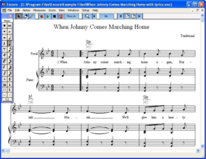
After evaluating Encore’s interface, we decided that a total redesign was necessary. Encore will be given a new modern look and new color themes. The palettes will be docked on the left side and can be repositioned or hidden by the user. The Control bar will be larger, placed at the top of screen, and will contain more important information.
Step 2: Consolidating the Palettes
Encore’s floating palettes have been an eye soar for many years. We have decided to dock them on left left side, give them a new look, and add their own menu with options to make the palettes larger, display a single palette, open all palettes, and close all palettes, etc..
Step 3: Redesigning the Toolbar
The Encore Toolbar is being redesigned with a vertical row of buttons docked on the right side. Most of the buttons will be used to replace menu items. Clicking on a button will open a panel to the left, allowing changes to be made directly on your score modeless without having to use a dialogs. This allows for a more […]
Step 4: Viewing Multiple Pages on Screen
Encore’s inability to display multiple pages at once on the screen is simply unbelievable! Encore 6 will have multiple pages that can be displayed horizontally. The main view will have several options for viewing the pages like Fit Width, Fit Height, and a few more.
Step 5: And Let’s Add a Piano Keyboard
Old Encore’s tiny keyboard has been replaced with a large realistic keyboard docked at the bottom of the display. There will be options on the keyboard to make step entry, smooth, intuitive, and fun to play. The keyboard is resizable, both horizontally and vertically.
Step 6: Encore 6 is Stepping in a New Direction
Although Encore 6 has been designed for those who want professional scores, we have made creating and editing a smooth easy process. Because tracks are the essence of your score we made accessibility as clear as possible. Press the track List button on the right side toolbar to open the tracklist. From here you can make basic changes. Click the […]


