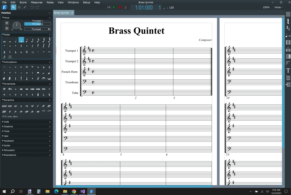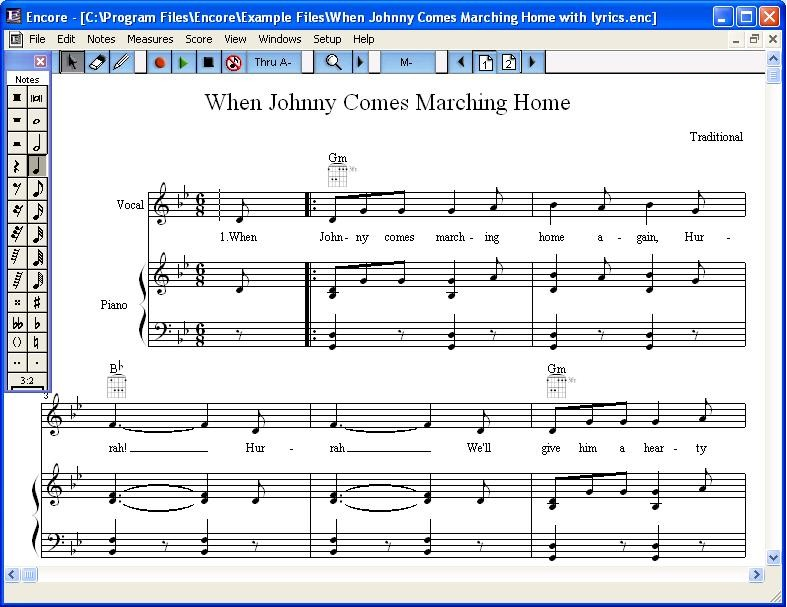
After evaluating Encore’s interface, we decided that a total redesign was necessary. Encore will be given a new modern look and new color themes. The palettes will be docked on the left side and can be repositioned or hidden by the user. The Control bar will be larger, placed at the top of screen, and will contain more important information.

No comments for “Step 1: Improving the Outdated Interface”